
Knowledge Center
Visual Summary
The Visual Summary is an interactive overview of the resources aggregated by the NIAID Data Ecosystem Discovery Portal. The Visual Summary presents key metadata in dynamic charts to help you quickly find relevant resources. The charts show how many datasets, tools, and other resources link to your search terms and how these break down by metadata categories. The interactive elements allow you to click directly on terms and chart segments to refine your search.
How to Use the Visual Summary #
Customizing the display #
The Visual Summary is displayed on the search results page. You can customize your Visual Summary by selecting which metadata fields you want visualized. Go to the list of filters on the left side of the search page and click the chart icons to select the fields you want visualized. A dark colored icon indicates that the field is selected and included in the Visual Summary. A light grey icon means the field is not selected.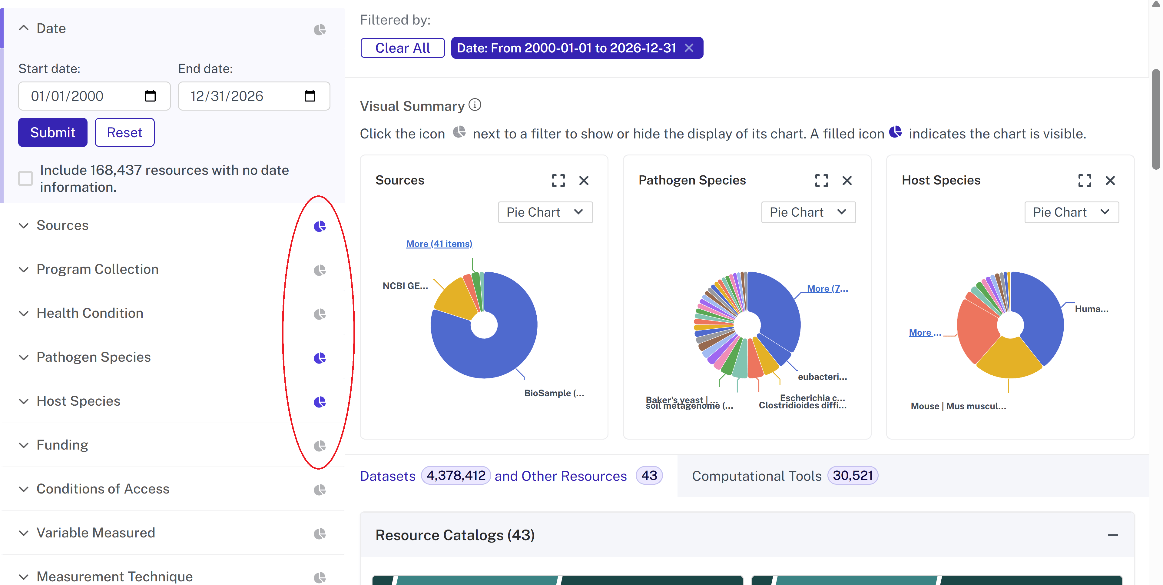
For each individual chart, you can also choose whether you want to view the information in a pie chart or bar chart by using the drop down within each chart.
Because each chart contains a large number of values, only the first ~10 largest values are displayed by default. You can view more by clicking “More (X items)” which is underlined in blue on each chart. As you add more items to the chart, you may want to expand the chart into a larger view. You can expand the chart into a modal view by clicking the square to the left of the x. If you have added more values to the charts but you want to go back to viewing fewer values, you can click the blue “Back” button.
Interacting with the charts #
You can interact with the Visual Summary to quickly refine and explore resources. If a value appears truncated or collapsed, hover over it to view the full label. Selecting a value in the pie or bar chart automatically filters the results to match that category. Remove a filter by going to “Filtered by” at the top and clicking the x next to the specific filter you want to remove (or click “Clear All” to remove all filters).
Example: Using the Visual Summary to Explore Datasets #
If a researcher wanted to see the breakdown of open tuberculosis datasets by species, the Visual Summary could provide this in seconds.
- Select the chart icons for the Health Condition, Host Species, and Conditions of Access filters.
- In the Health Conditions visualization, click “Tuberculosis.” The rest of the visualizations will automatically update.
- In the Conditions of Access visualization, click “Open Access.” This will continue to narrow the set of results and the visualizations.
- Expand the view of the Host Species filter to see a larger modal view of the breakdown of open tuberculosis datasets by species. Click one of the values to further filter the results and browse the available datasets.
Tips for using the Visual Summary: #
- Use charts together. The Visual Summary dynamically updates as you click values. Selecting a value in one chart will automatically update the others, allowing you to see how categories overlap.
- Watch how filters accumulate. As you select multiple values across charts, your result set becomes more specific. Check the “Filtered by” section to see which filters are active and clear if necessary.
- Use the Visual Summary as a pathway to resources. The Visual Summary is designed to guide you toward relevant datasets and other resources. Each chart value is clickable so you can get to a filtered set of resources.
To read more about filtering in the Discovery Portal, click here.
Last updated on